[h=2][/h]The Pentastar was created by Robert Stanley, at the Lippincott & Marguiles design firm. He wanted, according to his blog entry, “something simple, a classic, dynamic but stable shape for a mark that would lend itself to a highly designed, styled product. What that meant, basically, was a classic geometric form. We wanted something that was not stolid. That’s the reason that we broke up the pentagonal form that became the Pentastar. It provides a certain tension and a dynamic quality.” [This was reversed by Trevor Creed].
The [original] Pentastar was selected from more than 800 suggestions that a team from the design firm of Lippincott & Margulies Inc. proposed to the company.
“We were looking for something that would not be too complicated for people to remember and still have a very strong, engineered look to it,” said Robert Stanley. “We wanted something people could look at and say, ‘This was not done freehand.’”
In
Chrysler’s
annual report, they noted “A new Corporate Identity Office was established to be concerned with the manner in which the company identifies and visually presents itself and its products to the public. The [pentastar] emblem portrayed on the cover was developed as part of this broad program.”
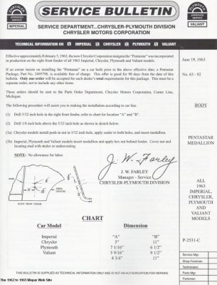
The Pentastar started showing up in ads with the 1963 model year; after initial production started, it was placed behind the right front wheel on 1963 model-year cars. Charlie Pfefferkorn, whose family owned Spaulding’s Garage (a DeSoto-Plymouth dealer and then a Chrysler-Plymouth shop) said that dealers were sent a Pentastar medallion kit for each 1963 car they had received before the factory started installing them. Spaudling’s Garage, and probably many other dealers, didn’t install them on cars they had already sold — Charlie said it would have been absurd to call
customers
and tell them they needed to bring their cars in for a bit of trim Chrysler had forgotten. The original Pentastars, incidentally, came with not one but two grips — the second, smaller pin was not just for location but also for extra grip (as shown in the photos.)
It first showed up in ads with the 1963 models, and started showing up on the 1963 cars behind the right front wheel, making its way to key blanks with the 1964 models. Prior to that, the Chrysler corporate logo was a pair of V-shapes, usually shown pointing to the right, part of Virgil Exner's "Forward Look" school of design. The new pentastar logo was also used on the front cover of the 1962 Annual Report — as an embossed cover (without any ink to set it off) — and on the back cover, in a deep blue.
In 1963, Bob Hope’s variety show (sponsored by the Chrysler Corporation) included opening graphics showing the segments of the Pentastar zooming into place with vroom-vroom noises, each piece accompanied by a callout of a brand - Plymouth, Dodge, Chrysler, Imperial, and Dodge
trucks
.
However, Bill Watson wrote noted that the five points do not stand for the five car divisions; at the time, Chrysler sold cars (Valiant, Plymouth, Dodge, Chrysler, Imperial, Hillman, Sunbeam, Singer, Humber, Simca), trucks (Dodge, Fargo, DeSoto, Commer, Karrier, Barreiros), industrial and marine engines, boats, army tanks, air conditioners, heating systems, chemicals, plastics, missiles, electronics, and financial products. Bill also noted that the design would be recognizable no matter which way you looked at it, even if the design was flipped or looked at upside down.
Original is at
Chrysler’s Pentastar (history of the logo) http://www.allpar.com/corporate/pentastar.html#ixzz2T8HOX3tO
Follow us:
@allparcom on Twitter |
allparcom on Facebook